
Welcome to ProjeQtOr new Forum. We migrated old forum to the new website.
You will find all your posts here, with your usual account.
Just one point : you’ll have to reinitialize your password. Use “Lost password” feature.

The Gantt Chart could be visually improved in two ways:
1. It does not leave any margin between the left edge and the bars. (The bars touch the left edge). Please provide 2 pixel space.
2. When the user selects to display the resource names (not initials), then the names hang out of the graph area. This looks clumsy. Please extend the graph till the names (labels)
Both problems are shown in the screenshot attached.
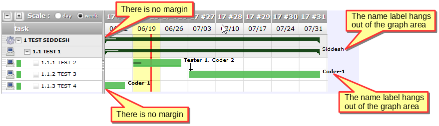

1. It does not leave any margin between the left edge and the bars. (The bars touch the left edge). Please provide 2 pixel space.
This seems to be a good idea because all your tasks start on first displayed day.
Try and display from current day, you'll see that extra margin would be weird for tasks starting before today.
2. When the user selects to display the resource names (not initials), then the names hang out of the graph area. This looks clumsy. Please extend the graph till the names (labels)
It may be a good idea but technically very difficult to draw : when we calculent width of chart, we do not know required space needed to display names (if any)
Moreover, this seems weird in your case because you choose a theme with relatively dask background. If this anoys you, try a lighter theme (for instance defaut one)